Design
Daniel Sabino
Art Direction
Beto Freitas
Julia Liberati
Agency
Tátil Design de Ideias
Production
Daniel Sabino
Lucas Gini
Year
2018
About this font
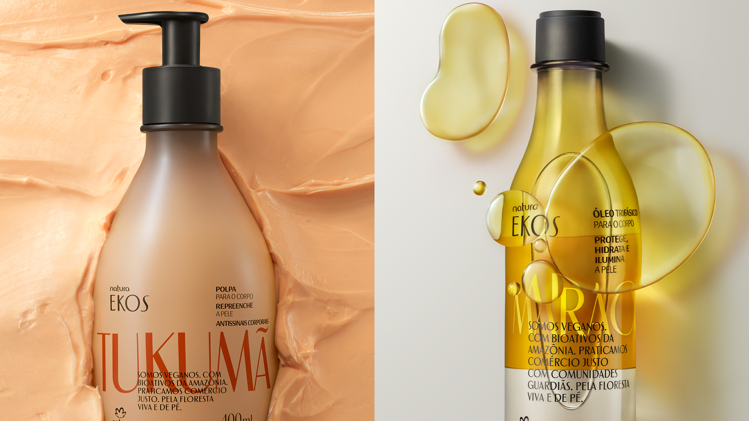
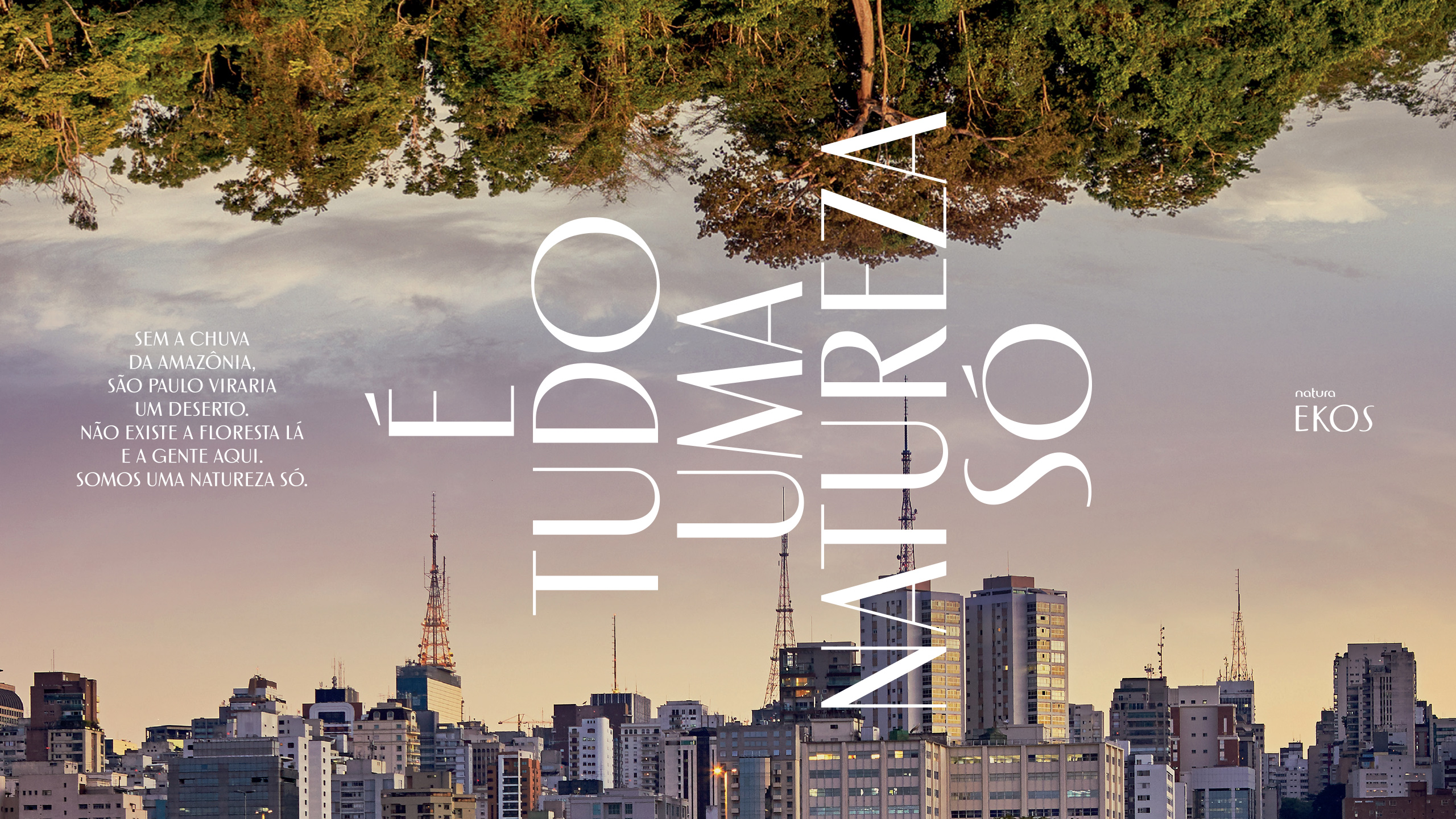
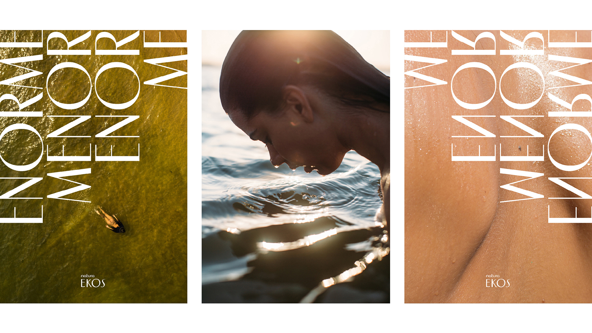
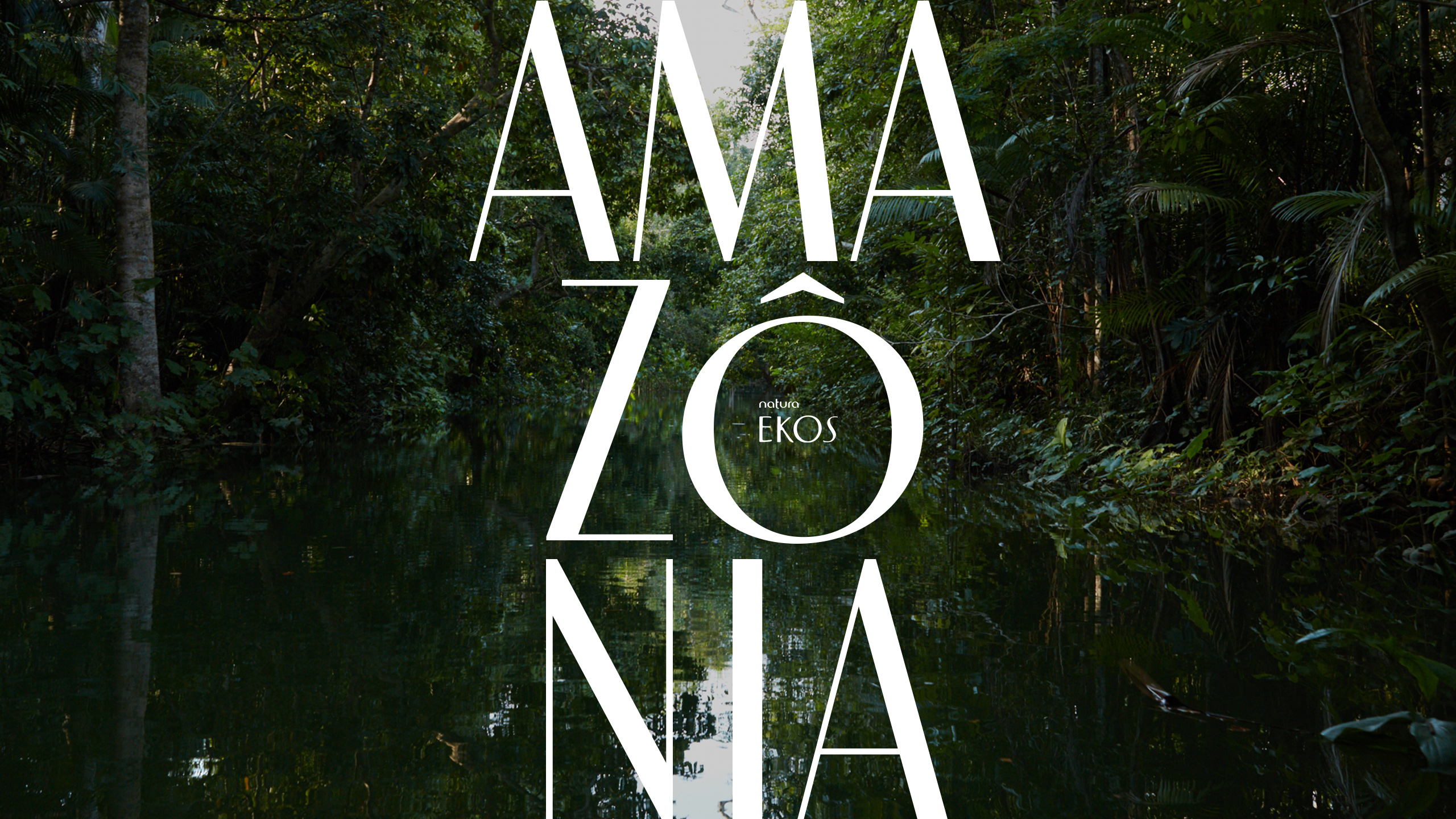
At the end of 2018, we were invited by brazilian agency Tátil Design to develop a proprietary typeface for Natura Ekos. The starting point was the brand’s logotype, from where we got the main inspirations.
The font would be used from medium to very large sizes, which explains the creation of two optical ranges. The names of the optical ranges make their choice easier for the users: Ekos 1230 performs better from 12 to 30 points, while Ekos 3100 is more recommended from 31 points.
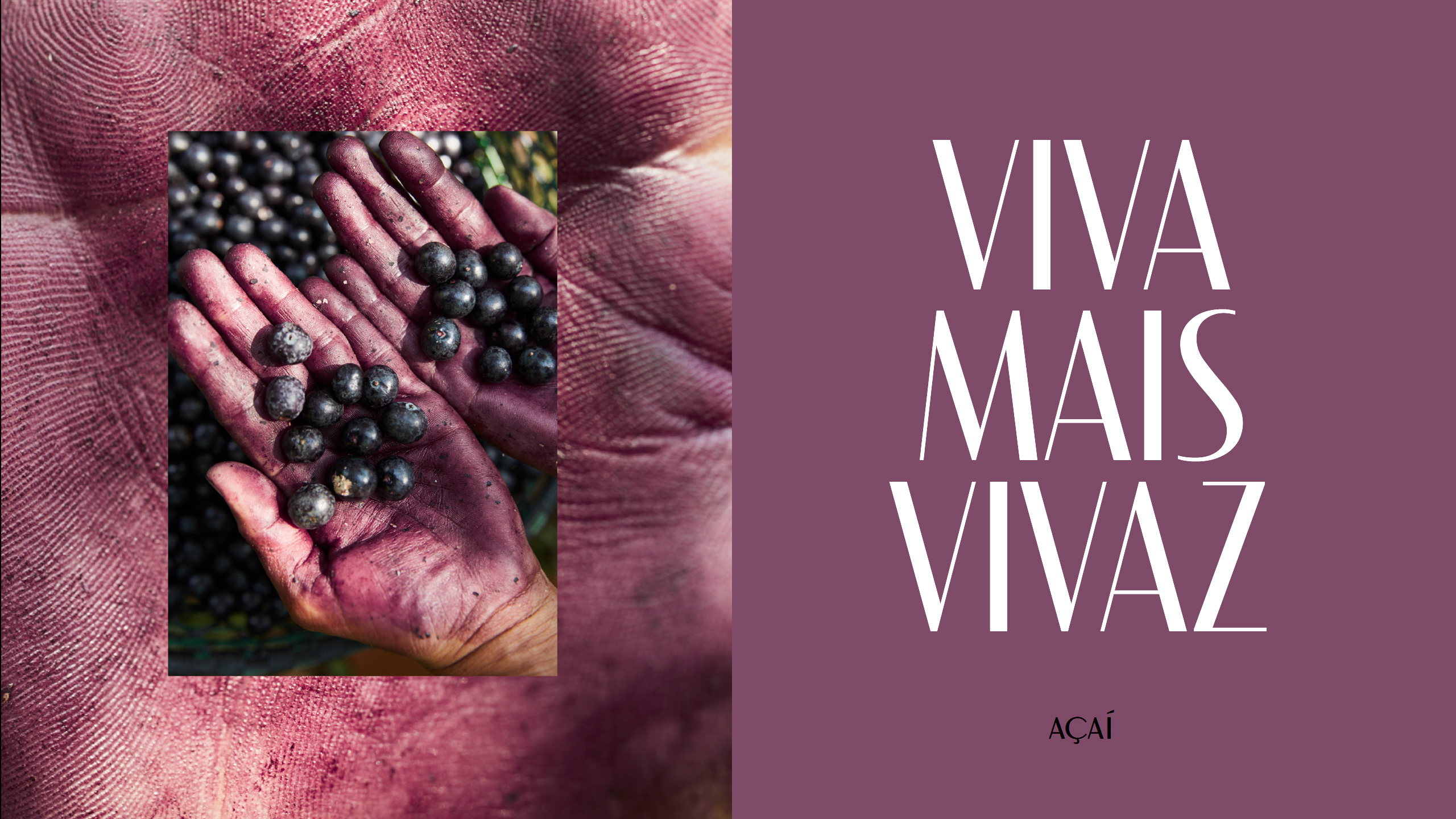
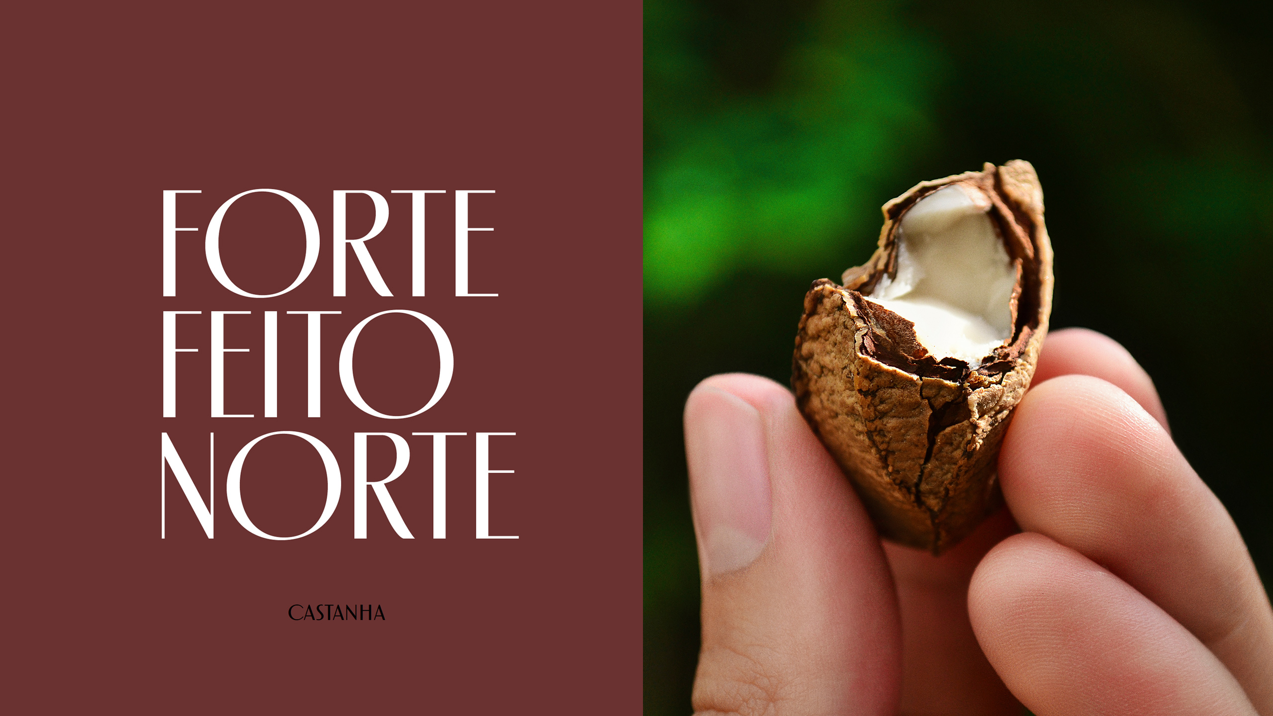
Tátil had a very clear idea of how they would like to use the typeface, and asked us to create some alternate letter inspired by those of Avant Garde Gothic for the triangular letters A M V W.
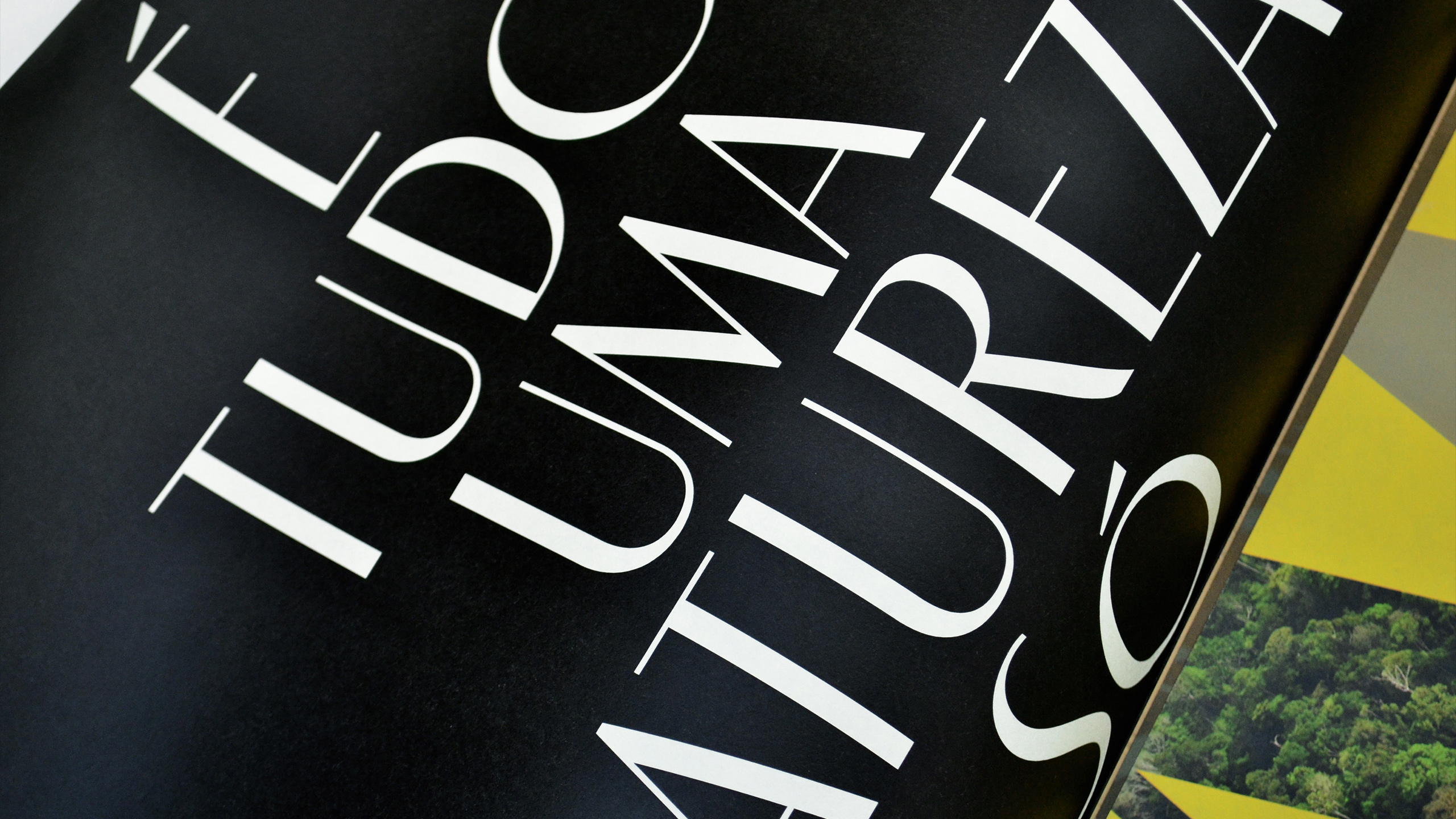
Because this is an all caps typeface, to allow text set without leading we designed letters Q J without descenders, preventing them from colliding with the bottom line. Then we made the diacritics of version 3100 as close as possible to the caps height. Even so, we prefer to create alternate versions of all accented letters.