Design
Blackletra + Nubank Brand Design Team
Creative Direction
Fernando Marar
Type Direction
Daniel Sabino
Blackletra team
Lucas Gini, Matheus 'Fio' Gonçalves, Daniel Sabino
Nu Team
Ariane Morganti, Arthur Reis, Cainã Nunes, Zé Zorzan, João Menezes, Isadora Stevani, Fernando Marar
Marketing Management
Isabella Marchese, Natalia Hazarian, Maria Guimarães
Marketing Director
Tiago Lara
Executive Producer
Guilherme Gaggl
External Consultant
Ondrej Bachor (All Caps Type Foundry)
Mastering
Noe Blanco
Year
2026
About this font
Nubank has been ranked #1 in the world in The Banker’s Top 50 Global Banking Brands study in 2025, and has more than 122 million clients in Brazil, Mexico, Colombia and USA. Stablished in 2013, it now serves more than 60% of Brazilian adults.
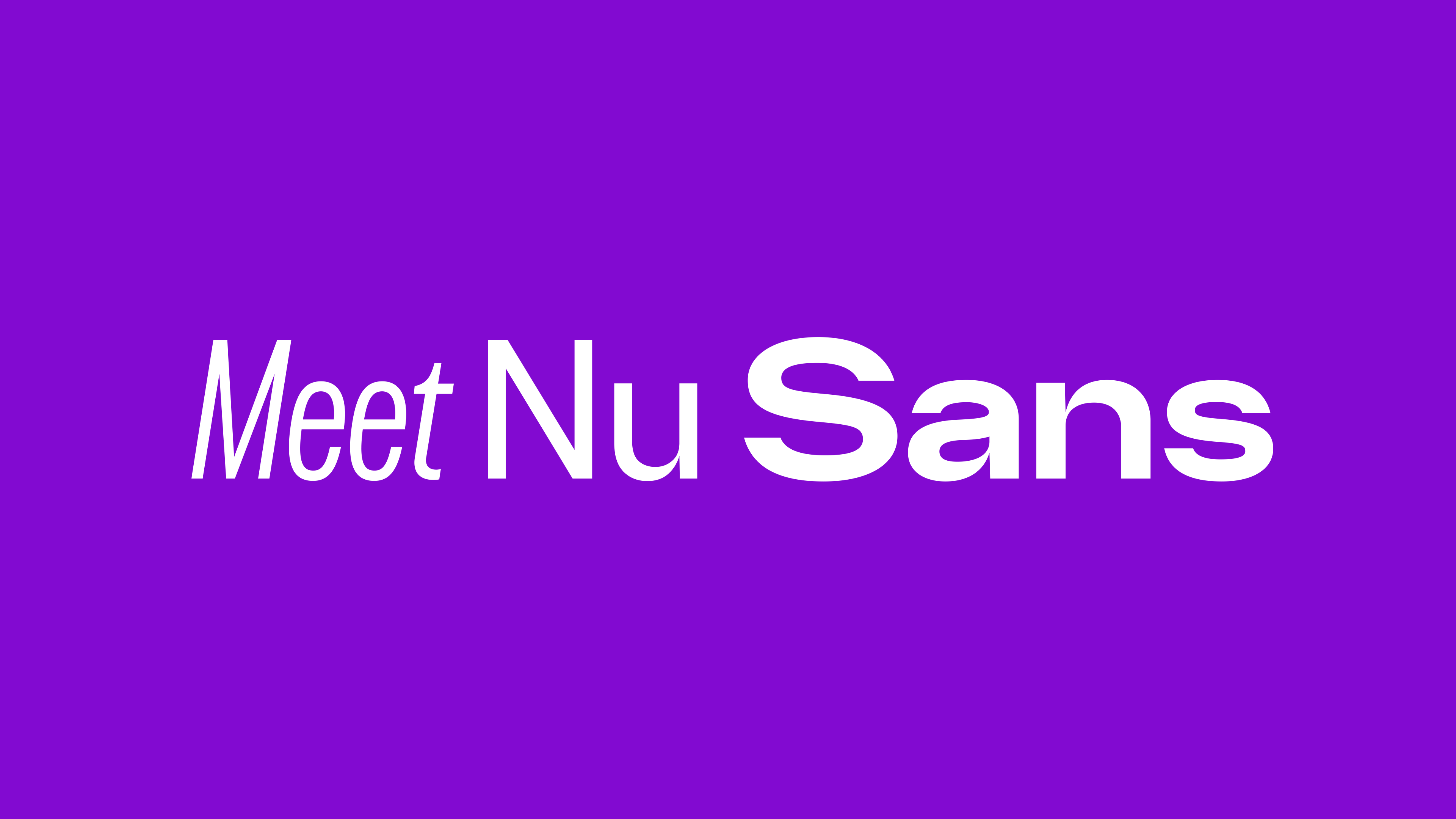
In 2024 the bank invited Blackletra to create it’s bespoke type family.
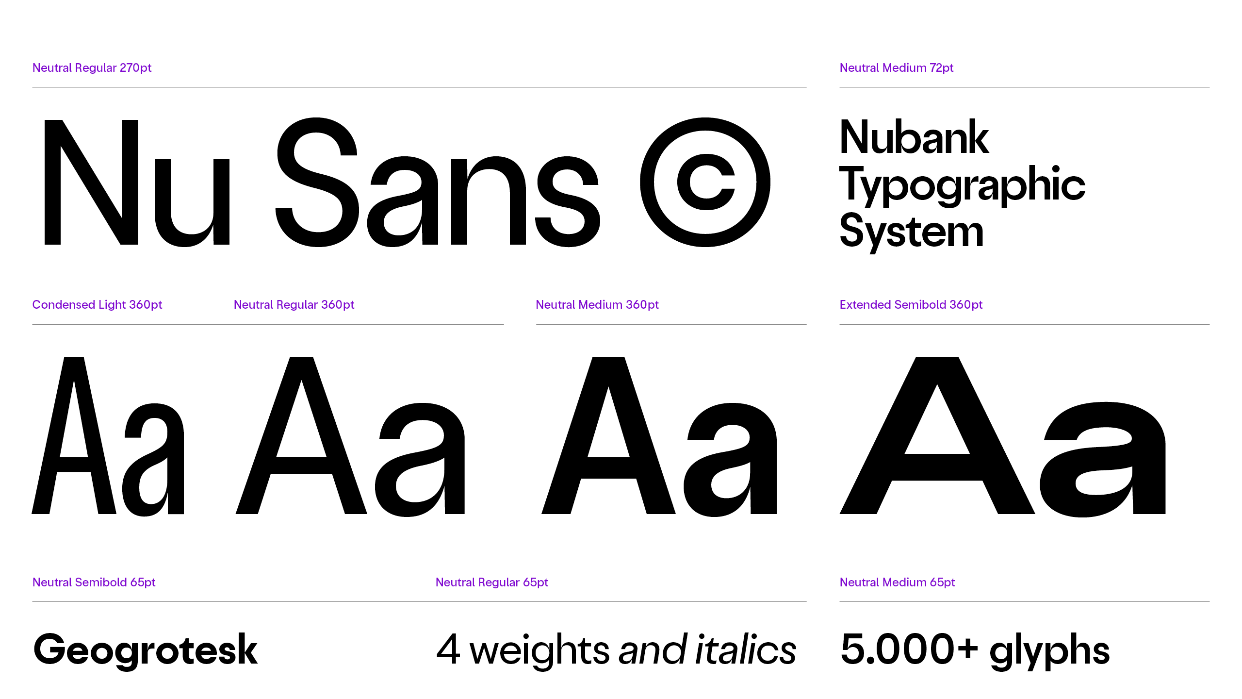
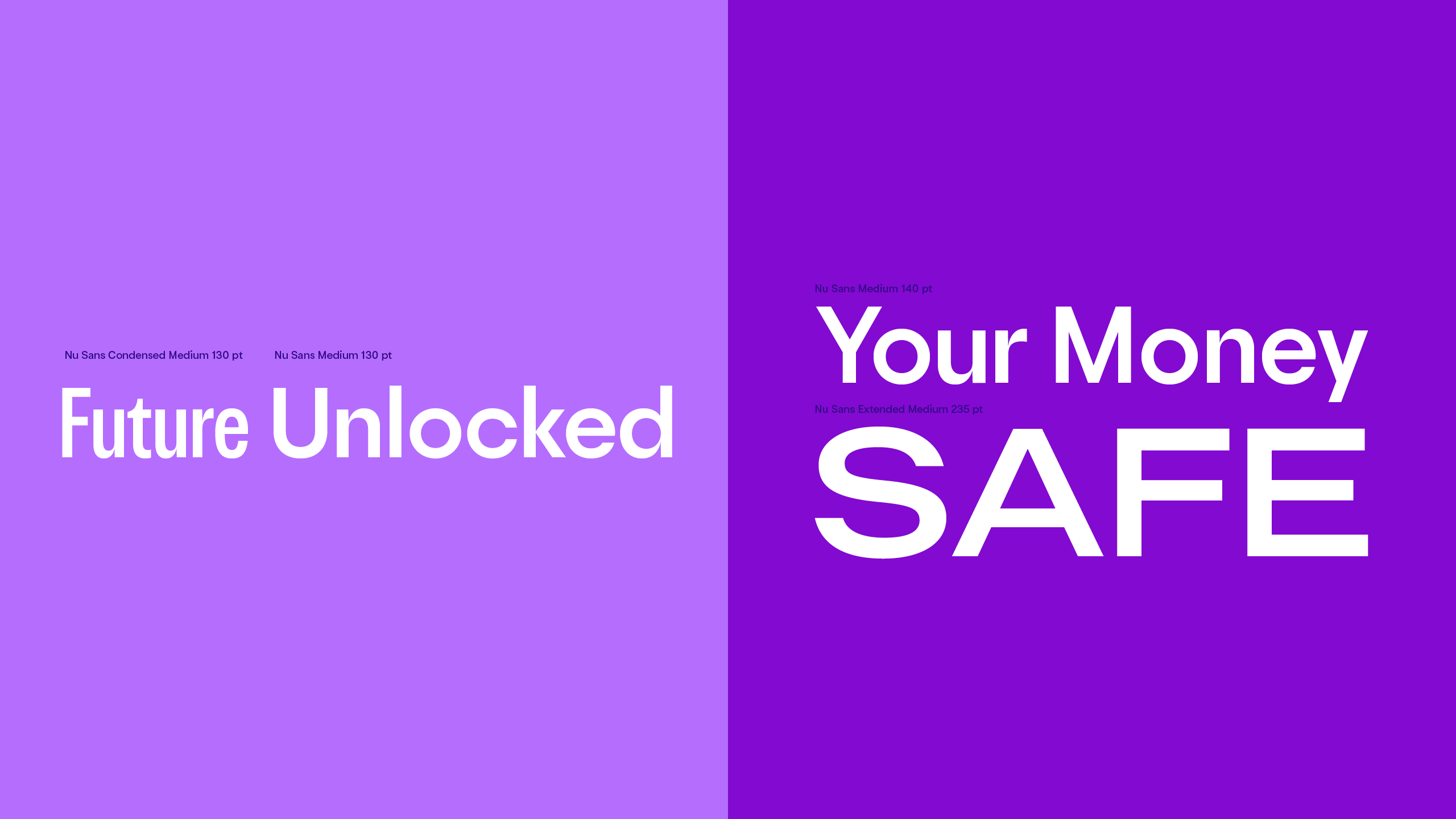
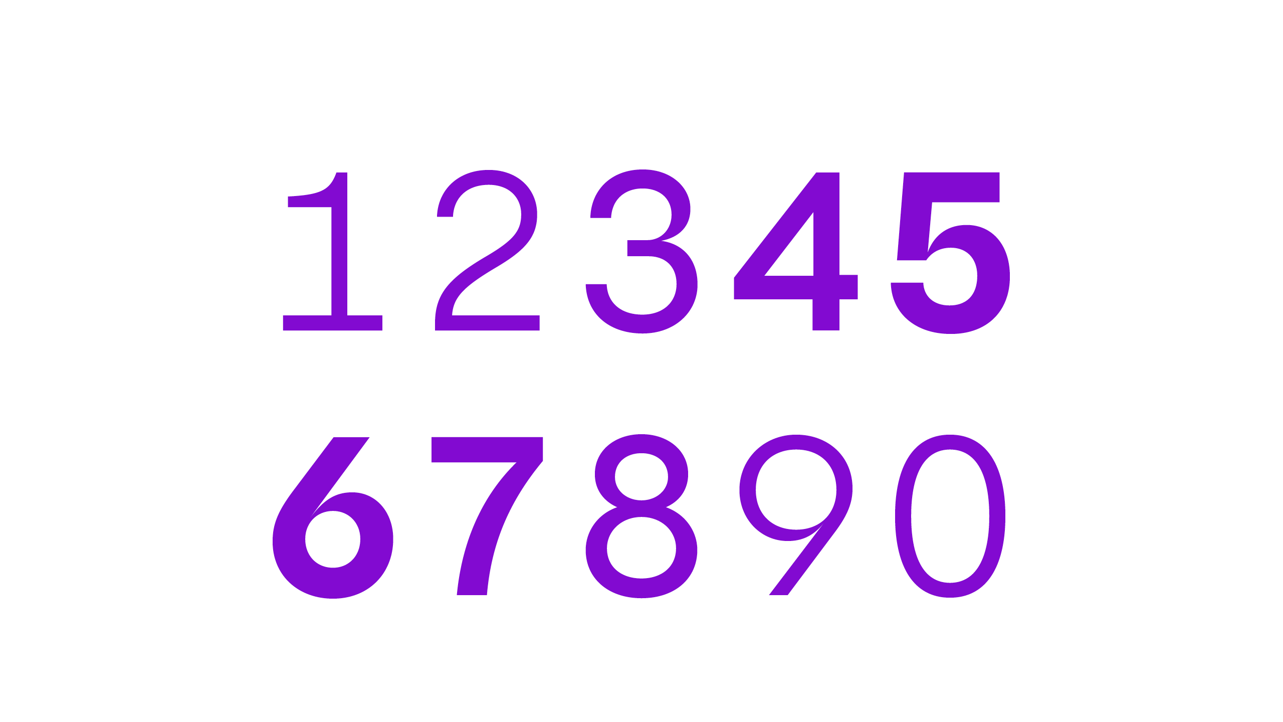
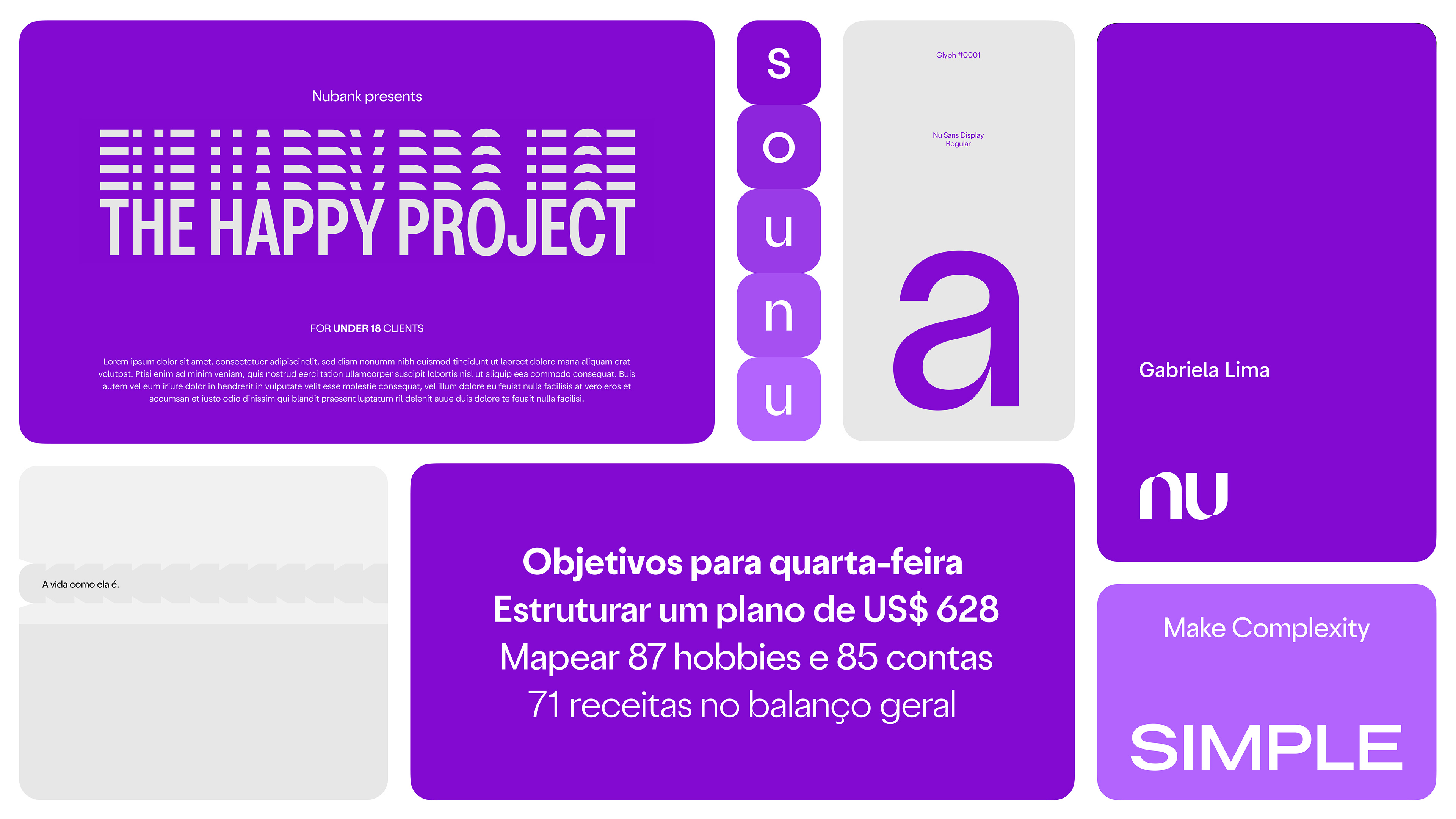
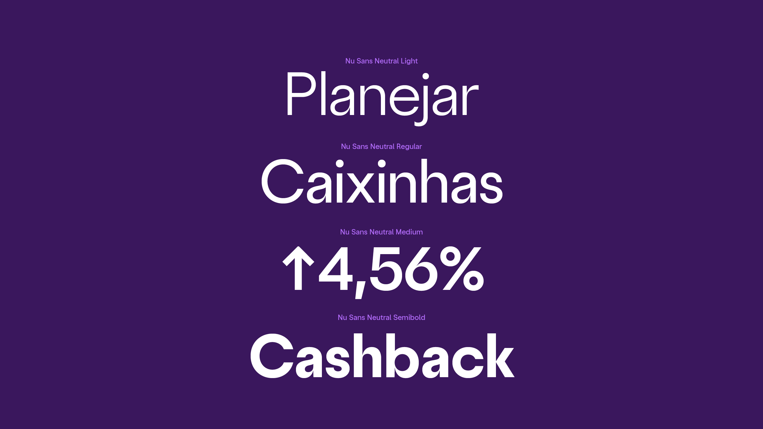
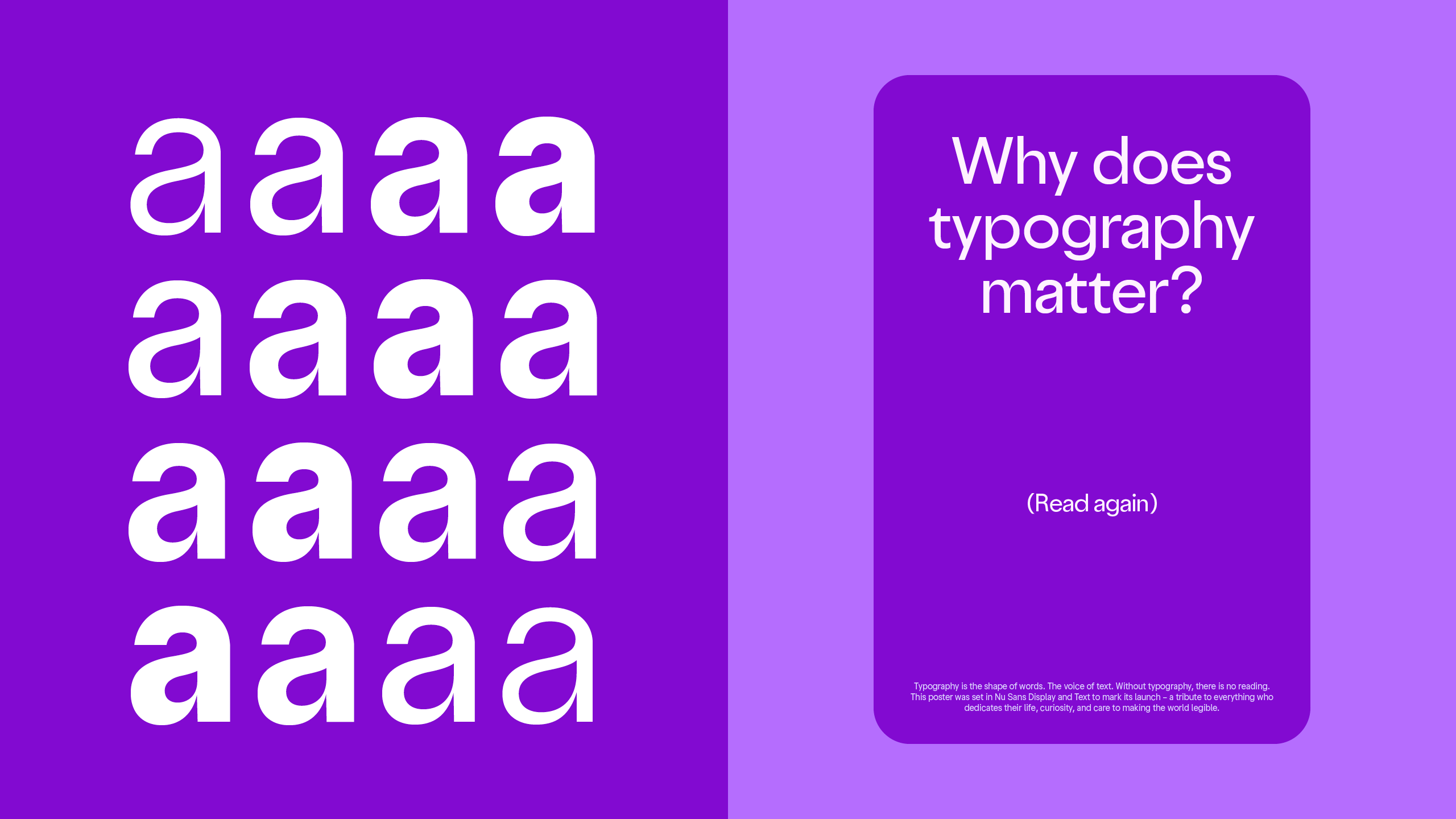
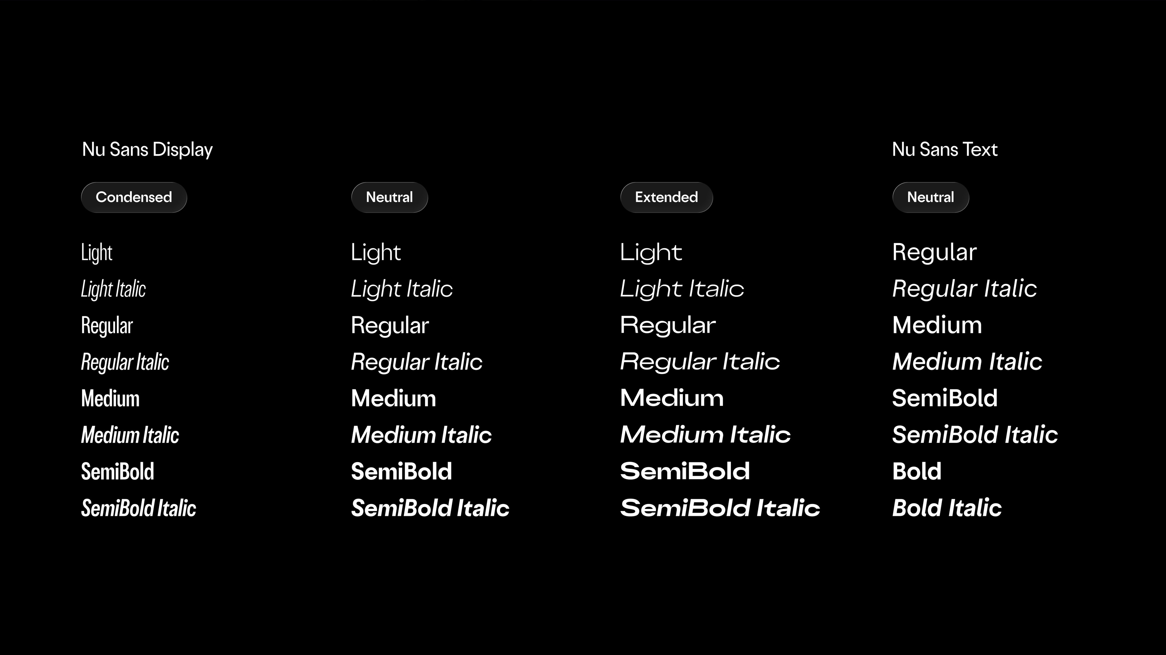
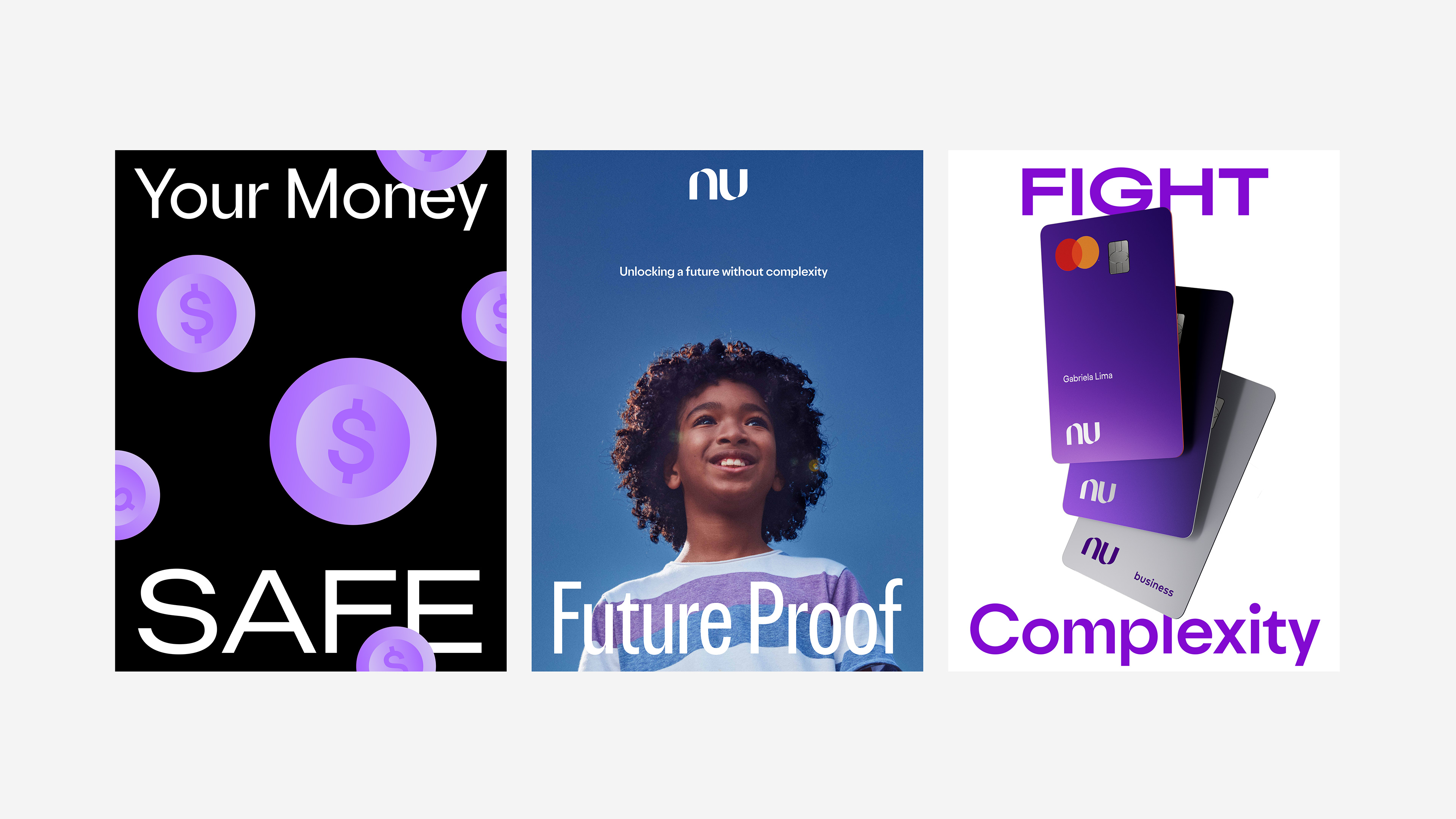
The logo joint was chosen as the inspiration for the font's neutral, timeless look — a direction that brings longevity while anchoring visually to a distinctive brand core element. The typeface family offers three widths, four weights, italics and two optical sizes – Text and Display – in a total of 32 fonts.
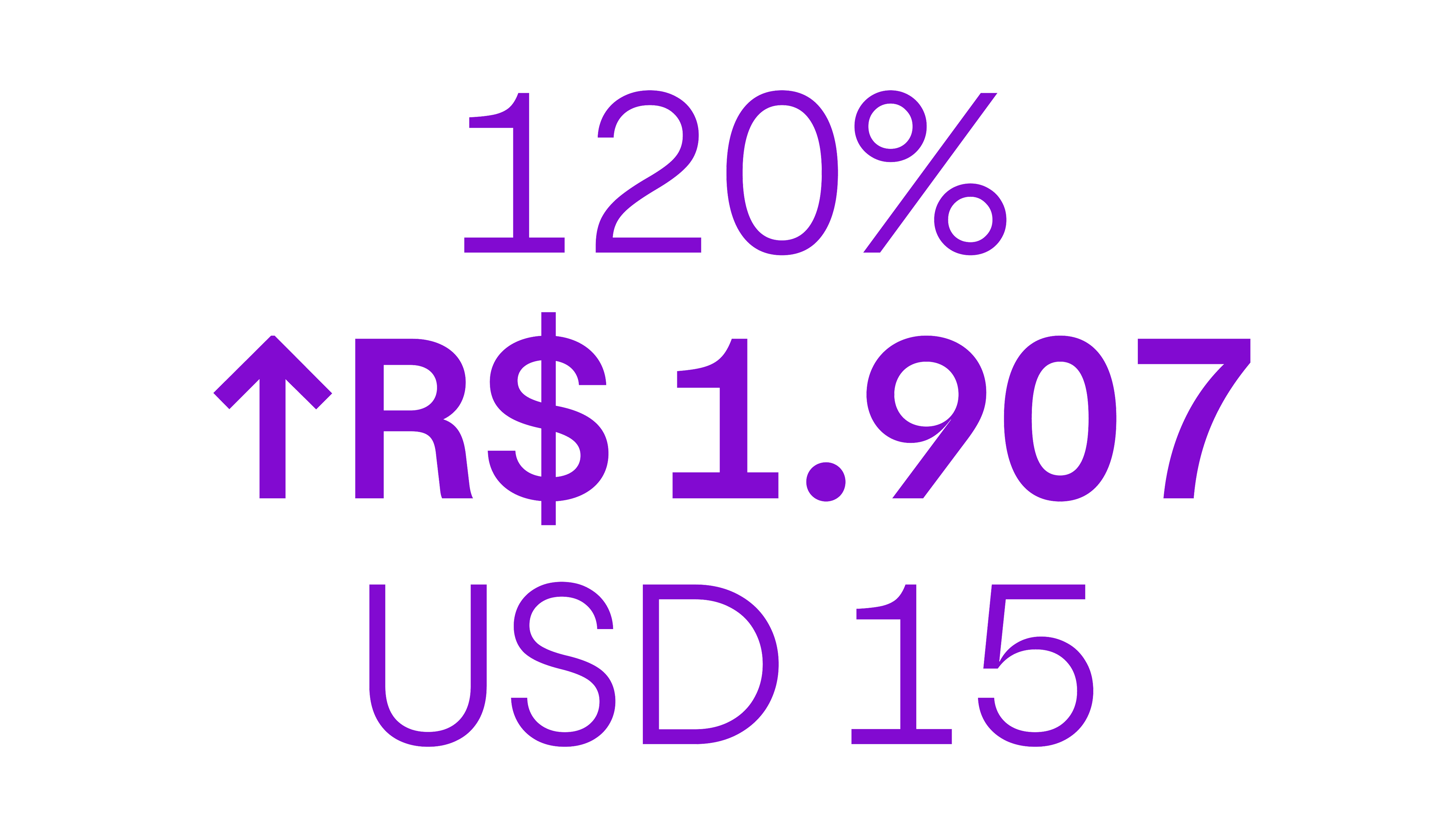
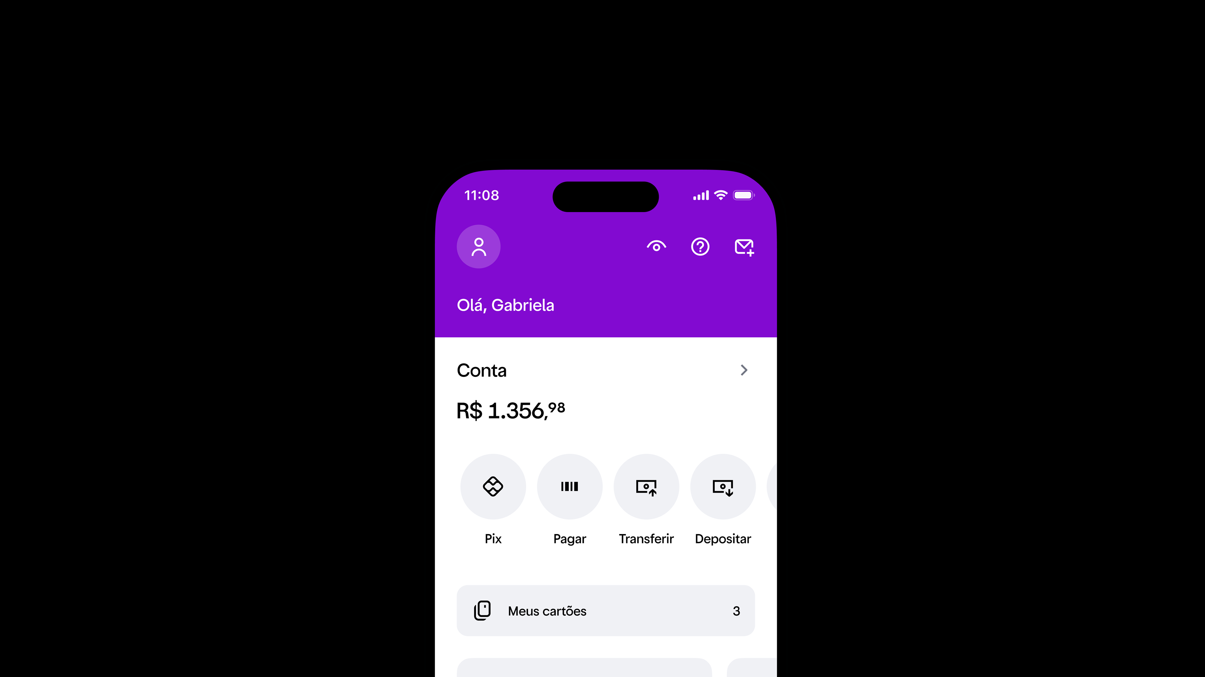
The simplicity of its geometric forms aligns with the brand's intentionally simple nature, while subtle details inspired by grotesk subgenre enhance readability and create a more balanced typographic experience.
This structure also scales seamlessly across text applications, enhancing readability. It stands out as the strongest option across all key brand evolution pillars: personality, performance, scalability, and accessibility.
Read more here.