Design
Daniel Sabino
Art Direction
Renan Benvenutti
Victor de Bone
João Augusto
Agency
Tátil Design de Ideias
Production
Daniel Sabino
Lucas Gini
Mastering
Henrique Beier
Year
2020
About this font
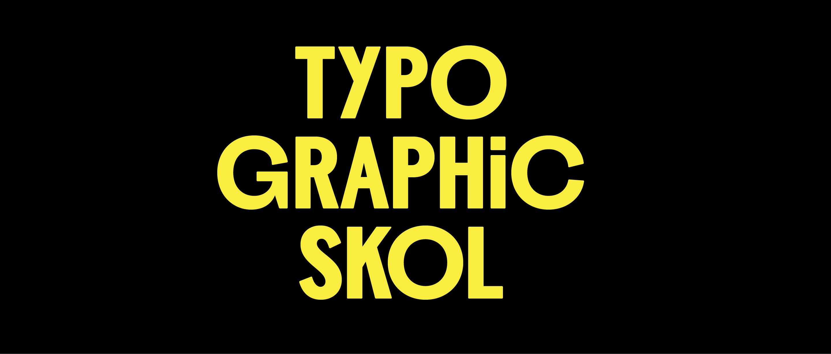
In early 2020, Tátil Design redesigned some elements of the Skol brand, and invited us to develop a typeface for the project. At first their idea was to replace the old font, LL Brown, with one with more condensed proportions that could deliver greater impact to the layouts.
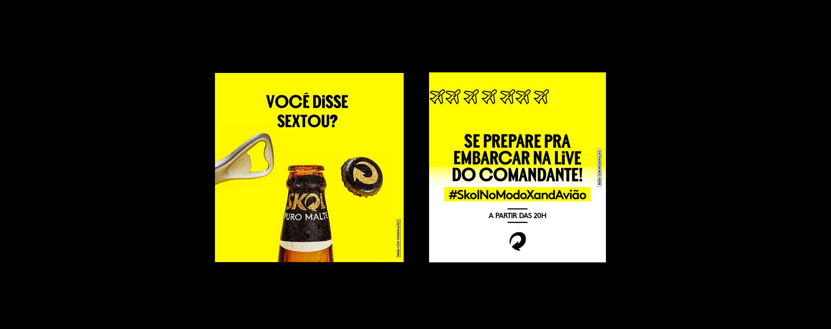
According to Tátil, reframing the term 'popular' was an important aspect of Skol’s brand concept at that moment: popular would be simple, made by people and relative or belonging to the people. Popular is authentic, fun, human and inventive. They wanted the new font to dialogue with this conceptual universe in a powerful and authentic way.
To establish this dialogue, we seek inspiration from nineteenth and early twentieth-century sans serifs such as Monotype Grotesk, Breite Grotesk among others. The genesis of what we now know as ‘sans serif’ owes a lot to that period.
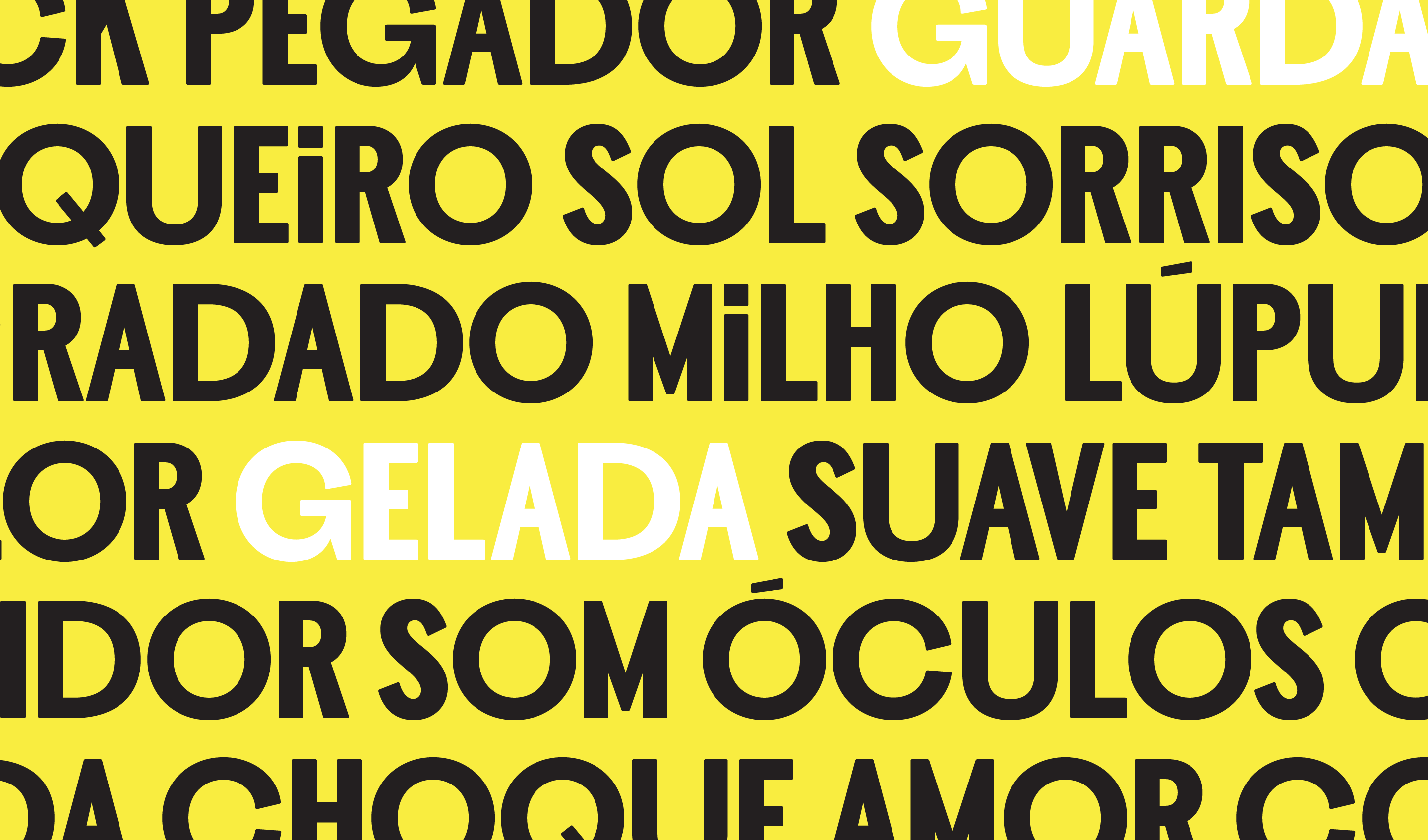
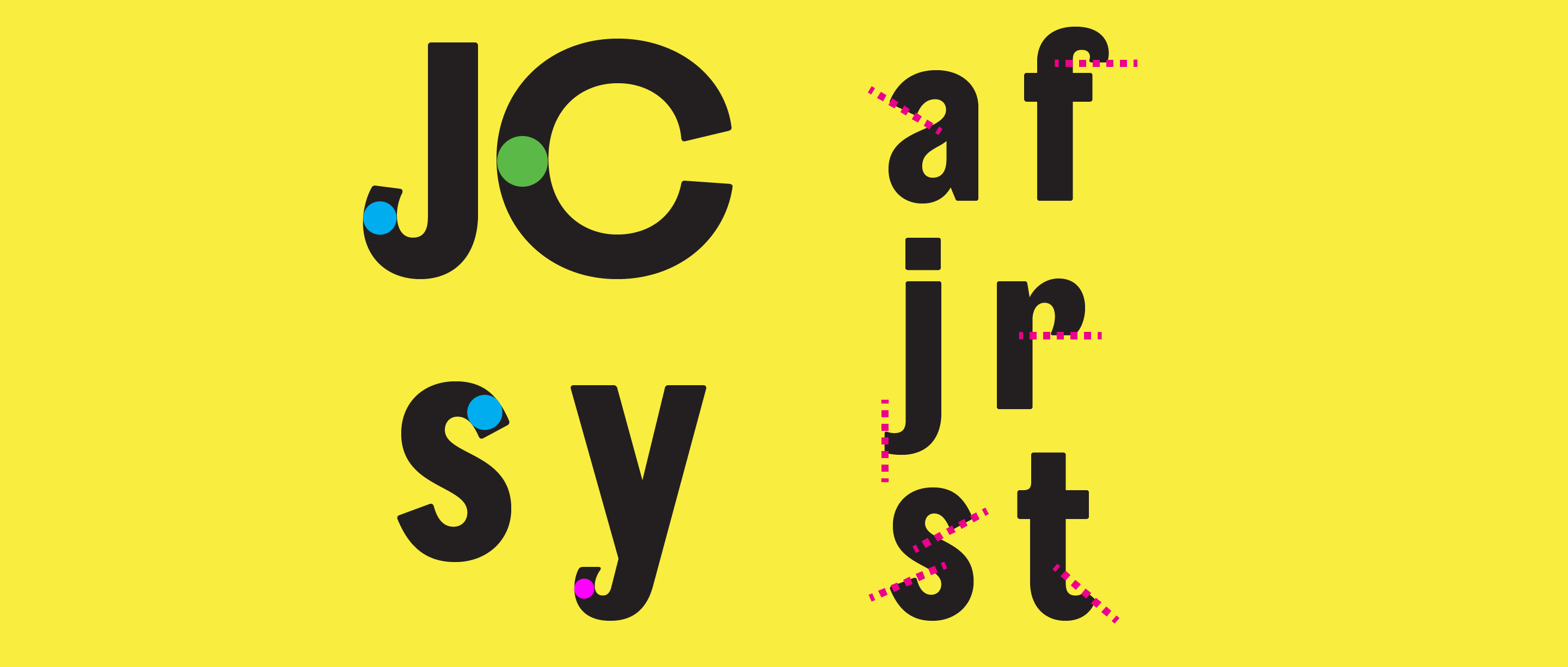
For today's eyes, so used to ultra-consistent systems and weights generated by interpolation, many of these original Grotesques have small idiosyncrasies that, in our opinion, are precisely what give them a certain personality. Many of them were not designed from the beginning to be families, so it is possible to detect small inconsistencies, especially when comparing different optical sizes of the same family. In the process of creating Skol Display, we understood that small inconsistencies like these could deliver the surprising aspect we wanted, making the type more authentic, fun, human and inventive.
Another reference was wood types. We felt that some compositions using wood types aroused a similar spirit, and that this was probably due to the seemingly random combination of different typographic fonts in different sizes and widths.
This is why we created a great variation of widths between the round letters O Q D C G and the others. Such letters abandon the condensed proportions providing a particular rhythm to the compositions, which in some way dialogs with the concept of the brand. Another feature that we ended up importing from letterpress was the rounded corners, inspired by the natural wear and tear of wood types.
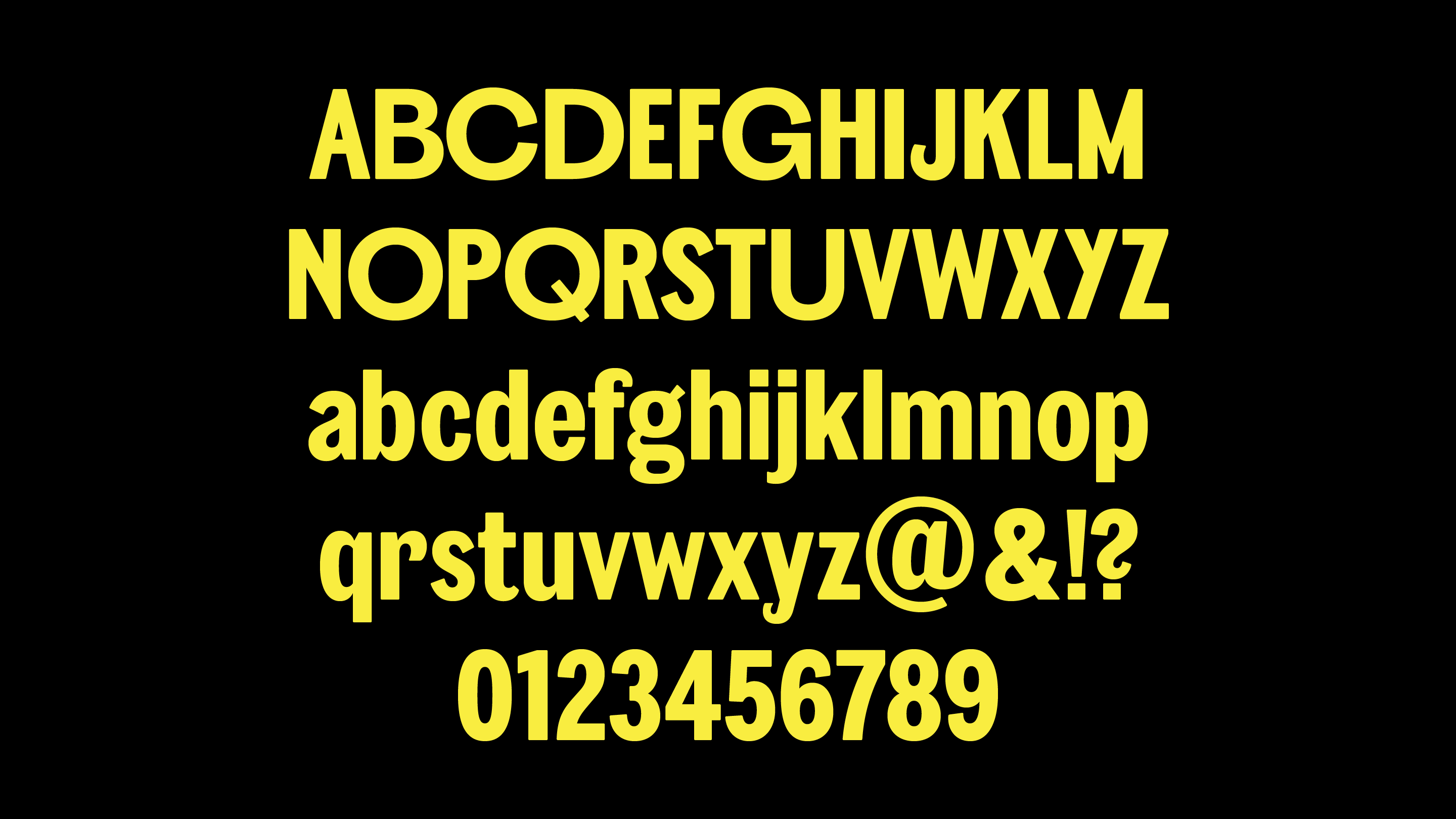
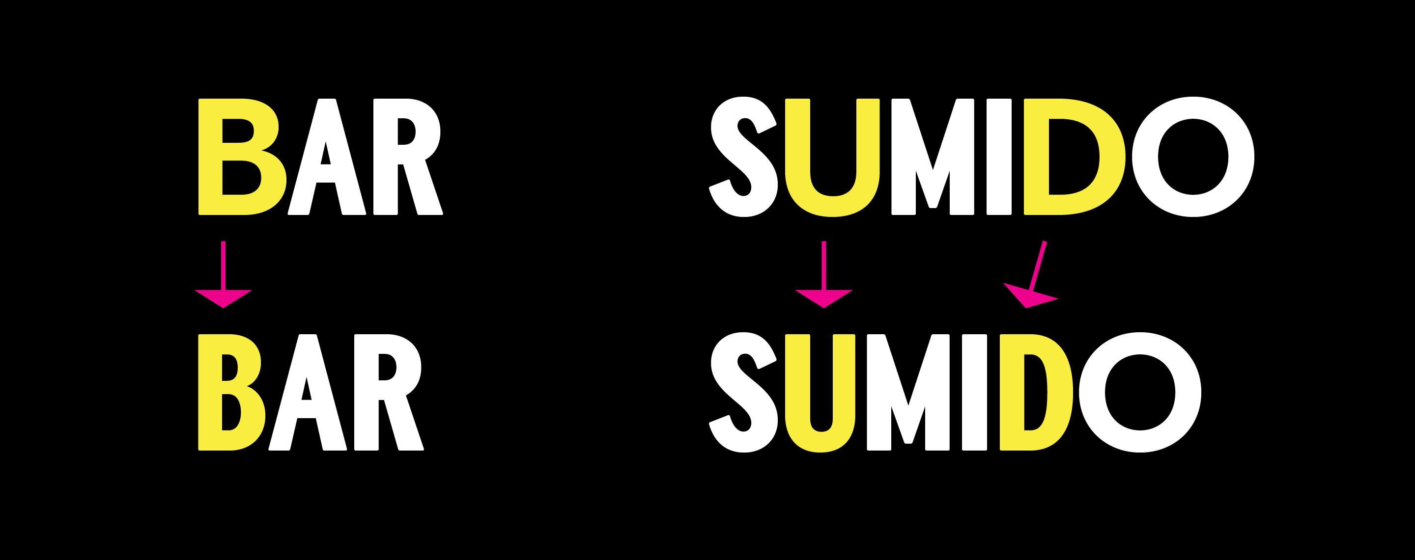
Although vernacular typography was not a central reference in the creation process, one of its most typical manifestations in Brazil ended up being suggested as a use: the capital letter I with a dot. The letters B D U have condensed alternate characters that can be accessed via Stylistic Sets in Adobe software. We have included in the font a set of 50 icons created by Tátil and refined by us. In order to facilitate the access, we created a simple code that allows automatic replacement: =iconname=
Awards & recognitions
Brasil Design Awards 2020 Bronze Medal